


ALEKS Assignment List
ALEKS is an adaptive online learning program for Math and Chemistry. It empowers educators to provide customized and adaptive content tailored to each student's needs. One of its core components is the assignment list, a tool instructors depend on to structure their class materials and create unique learning experiences. However, the existing ALEKS assignment list doesn't allow instructors to achieve their full potential.
Project Duration & Type
3 Months, Company Project
My Contributions
Project Scoping, UX Design
Team
2 Sprint Teams, PMs, Business Stakeholders
User experience was ruined by a simple rule.
The ALEKS assignment list had a simple but very restricting rule: assignments were organized and displayed based on their due dates/times. While this rule worked in many cases, it didn't account for many nuanced yet common situations.
1. Due Date sorting broke the desired organization.
Syllabi are often different from the content order in the textbook. Nevertheless, instructors might still choose to organize their assignments based on textbook chapters for simplicity. In such scenarios, sorting assignments by due date can cause frustrations.

2. Due date sorting gave students the wrong impression.
When assignment dates were not precisely aligned, the ALEKS assignment list could become a source of confusion. In the following case, students expected to finish "Chapter 1 Homework" after "Chapter 1 Quiz" without noticing that the homework starts before the quiz.

3. Due date sorting made the assignment list messy.
Some ALEKS users created personalized assignments for each student. Imagine an assignment list for a class of 20 students, each with 10 unique tasks. The resulting list would become overwhelming and chaotic to navigate.

Lacking control was the core issue.
Because of due date sorting, instructors lacked control over the display of the assignment list. The main goal of this project was to empower instructors to steer the display and organization of the ALEKS assignment list. To achieve that, the team decided to provide instructors the following abilities.
- Allow instructors to reorder assignment display sequence.
- Allow instructors to create assignment folders for better organization.
Additionally, based on previous user research, the ALEKS assignment list has to do 2 other things.
- Allow instructors to view all assignments at the same time.
- Present necessary assignment details for instructors to take actions.
However, there wasn't enough real estate.
The ALEKS assignment list employs a table component, and the presented information occupied the full width of each column. As a result, I didn't have enough real estate to include new features. After examining the assignment list, I decided to relocate Assignment Type and place it underneath the assignment name due to the following reasons.
- Among all the columns, assignment type is arguably the least important, especially when icons could distinguish assignment types.*
- Showing a subtitle within the 1st column is a part of the table component design.
- By performing this update, the assignment list becomes less crowded, and it gives me more freedom to explore new features.
*There are many issues with the current design of these icons. Updating them is a part of another project.
.jpg)
.jpg)
Moving forward, I chose to explore assignment folder first for 2 reasons.
- Assignment folder is more complex and has more uncertainties.
- The design of reordering assignments depends heavily on how assignment folder functions.
Classic folder structure designs didn't work for ALEKS.


File Management Systems
Although this is a well-established design, it doesn't allow users to view everything all at once.
Tree Structures
Contrasting to file management systems, users are able to view all items; however, instructors require more details of each assignment than just the name.
Therefore, I needed to explore other options.
Rather than focusing on UI improvements, the goal of this exploration was to rapidly generate and visualize ideas. Throughout this process, I devised many variations. I'd like to highlight 4 directions.
Idea 1: Expandable Table
This is a relatively popular table design pattern, often used to show more attributes of a table item. This could be an elegant solution, but the assignment hierarchy can be disordered when multiple folder levels are needed.


Idea 2: Section Header & Indentation
This idea enables users to create section headers within a table to separate various groups of assignments. Users can then indent table rows to establish hierarchy. However, sections can't be collapsed, and this design can have a steep learning curve.
Idea 3: Embodying Accordion in Table
I wanted to eliminate the disadvantages of idea 1&2 by combining them. This effort led me to replacing folders with accordions. Although, it solves some issues; this design feels mediocre and complicated.


Idea 4: Tabs
ALEKS users love tabs, so I examined how tabs might work.
- First Tab: The default tab is still the existing ALEKS assignment list, sorted by due dates. This allows instructors to view all of their assignments together.
- Second Tab: This is dedicated to users who are not satisfied with the existing design. It works more like a file management system.
I have to admit this was an over-engineered solution.
Expandable table won the battle.
1. User Familiarity
Most ALEKS users are familiar with the design of expandable tables, so no user training is necessary. More importantly, based on a quick user feedback session, users favored the idea of expandable tables.
2. No Nested Folders
When there are nested folders, the expandable table design could break apart. However, we learned that only a few instructors find having multiple levels helpful, which meant we can avoid this issue.
3. Low Developing Effort
Because of a tight timeline, the product team needed to carefully plan how to allocate engineering resources. By picking this idea, we could leverage existing code and shorten the development cycle.

Creating New Folders
I devoted extra effort to design the process of create assignment folders. It might seem straight forward to just add a "New Assignment Folder" button, yet there was a catch.


Cater to a Different Mental Modal
Because the proposed folder structure deviated from popular file management systems, some users had a different mental modal. They viewed the action of moving assignments to a folder as grouping. This mental modal become more prevalent especially when many instructors prefer to build all assignments before making any folders. To cater this unique mental modal, I included another way to create folders.


Next, I tackled reordering.
For this feature, there were 4 goals.
- Drag & Drop: Many users expect to use drag and drop to reorder.
- Clear Indication: When dragging an item, users should know where it would be placed.
- Drop Zone Size: It should be large enough for users to interact easily.
- Alternative Interaction: Drag and drop couldn't be the only way to reorder the list.
Clear Indication
To clearly signify the drop location, I decided to implement highlights thanks to 2 reasons.
- Given the length of many assignment lists, we aimed for a subtle but clear indicator to avoid introducing distractions.
- Table highlights have been developed previously for other projects, allowing sprint teams to reuse existing code.
There are 3 types of indications.


The Design Challenge of Drop Zones
Because folders and assignments behave differently, they should have different drop zones. Since folders can't be nested, reordering folders is basically reordering a list of items, of which the interaction is common. Here is an example of how folder drop zones work.
- Drop Zone 1: Before "Initial Assessment"
- Drop Zone 2: Between "Initial Assessment" & "Week 1"
- Drop Zone 3: Between "Week 1" & "Week 2"
- Drop Zone 4: Between "Week 2" & "Extra Credit Assignment"
- Drop Zone 5: After "Extra Credit Assignment"


The real challenge came when designing drop zones for assignments. How should the assignment be placed if it is dropped to Area 1 or 2 in the following image?
- Area 1: Should it be placed within one of the folders or in-between them?
- Area 2: Should it be placed inside the "Week 2" folder?

How did others deal with this conundrum?
There was a popular solution. I use Webflow as an example.*
- Drop Zone 1: Within "Div Block 1"
- Drop Zone 2: Within "Div Block 2"
- Drop Zone 3: Between "Div Block 1" & "Div Block 2"
- Drop Zone 4: After "Div Block 2"
If I aim to move something out of "Div Block 2", I need to drag the item horizontally from Drop Zone 2 to Drop Zone 4. Although it's relatively intuitive, the interaction can be clunky. Since I was working with a table, there were rooms to improve.
*These drop zones are not precise. I'm just showing a general idea.
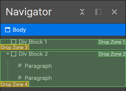
Table has a unique advantage.
Comparing to lists, tables are larger. I was able to assign bigger area to each drop zone, and no horizontal cursor movement was needed.
- Drop Zone 1: Before "Initial Assessment"
- Drop Zone 2: Between "Initial Assessment" and "Week 1"
- Drop Zone 3: Within "Week 1"
- Drop Zone 4: Between "Week 1" and "Week 2"
- Drop Zone 5: Within "Week 2" and before "Week 2 Assignment"
- Drop Zone 6: Within "Week 2" and after "Week 2 Assignment"
- Drop Zone 7: Between "Week 2" and "Extra Credit Assignment"
- Drop Zone 8: After "Extra Credit Assignment"


Reordering Without Drag & Drop
For users who have disabilities or don't prefer drag & drop, an alternative interaction is required.


Looking back...
Designing for a diverse user base requires balancing.
ALEKS is used by millions of instructors. When a product reaches such a scale, catering to the diverse user needs is challenging. From college professors to elementary school teachers, each educator brings a distinct teaching style and expect ALEKS to adapt accordingly.
The assignment list is utilized by every ALEKS users, so striking a balance between various requests was a regular task. During the design process, every decision had the potential to affect various user groups differently. I had to carefully consider the consequences to find a solution that could satisfy most users. However, by aiming for this balance, there's an implicit choice to ignore the needs of minority groups.
This raises a pertinent design question: should we aim for a design that's moderately effective for all or tailor it to be perfect for some? This is a tough question, and I continue to seek its answer.